A PDF can look polished, professional, and ready for publication while still being frustrating to use. The headings line up perfectly, the charts look sharp, and every page appears exactly as intended. But ask someone to navigate the document with a screen reader, select text from a scanned page, or jump directly to a section using assistive technology, and that beautiful layout might tell a very different story.
- What Makes a PDF Difficult to Read?
- Seeing a Page Is Not the Same as Understanding It
- Where Accessibility Problems Hide in Everyday Documents
- Test the Reading Experience, Not Just the Design
- What If Your PDF Needs Structural Repairs?
- Make Accessibility Part of Publishing
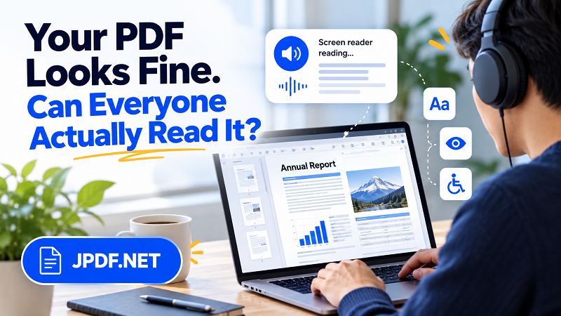
That's the catch with PDF accessibility: looking readable isn't the same as being accessible. A document needs more than clean typography and attractive page design. Its content must also be structured in a way that different people and technologies can understand.
What Makes a PDF Difficult to Read?
PDFs preserve the appearance of documents, which is one reason they're so popular. Unfortunately, preserving appearance doesn't automatically preserve meaningful structure. A heading might look like a heading because it's large and bold, but the document may not identify it as one. A paragraph might sit neatly beneath a title on the page while its underlying reading order places it somewhere else entirely.
These differences matter when people rely on screen readers, keyboard navigation, text-to-speech software, or other assistive technologies. Without useful structure, moving through a long report can become a tedious exercise in navigating disconnected pieces of information rather than reading a coherent document.
Scanned PDFs introduce another common obstacle. When a page is simply a photograph of printed text, the words may be visible to your eyes but unavailable as selectable, searchable text. Optical character recognition (OCR) can recognize text in images and make it accessible to more digital workflows, although OCR alone doesn't guarantee correct reading order, semantic structure, or full accessibility.
Seeing a Page Is Not the Same as Understanding It
Think about a business report with two columns, a chart, and several callout boxes. A sighted reader can follow the layout naturally, using spacing and visual hierarchy to understand how everything fits together. A screen reader, however, depends on the document's underlying structure and reading sequence to communicate that information meaningfully.
If the reading order jumps between columns, a sentence may be interrupted by unrelated text. If a chart contains essential information but has no useful alternative description, someone who cannot see it may miss the main finding. And if headings aren't properly identified, navigating a lengthy report by section becomes much harder.
Tables can create similar problems when their relationships aren't defined clearly. Someone viewing a table can usually connect a value with its column heading by looking at the page. Assistive technology needs appropriate structural information to communicate those relationships reliably. A table that looks obvious visually may become confusing when its structure is missing or incorrectly defined.
The lesson is simple: design communicates visually, but document structure helps communicate meaning. A genuinely accessible PDF needs both.
Where Accessibility Problems Hide in Everyday Documents
Accessibility issues aren't limited to complex government reports or technical publications. They can appear in ordinary documents that people create every day.
- Training manuals: Decorative headings may not be marked as actual headings, making it harder to navigate between lessons or procedures.
- Forms and applications: Fields may look obvious on the page but lack meaningful labels or a logical keyboard navigation sequence.
- Scanned contracts and handouts: Pages may contain images of text rather than machine-readable content, preventing reliable text selection and assistive reading.
- Reports with charts: Important findings may exist only as visual elements, leaving users without sufficient information when those elements cannot be perceived.
- Multi-column documents: An incorrect reading sequence can mix sentences, captions, and sidebars into a confusing stream of text.
These problems share a common theme: the document was designed around how it looks on a screen or printed page, without enough attention to how people will interact with its content.
Test the Reading Experience, Not Just the Design
You don't need to be an accessibility specialist to start identifying potential problems. Begin by selecting and copying text from different pages. If an entire page behaves like one image, the document may need OCR. If selectable text comes out in a strange sequence, its underlying content order may need attention.
Next, inspect the document's headings and tags. A properly structured PDF can identify headings, paragraphs, lists, tables, and other content elements instead of relying entirely on visual formatting. Check whether the reading order makes sense, especially on pages with columns, sidebars, or complex graphics. Try navigating the document with a keyboard, and use a screen reader when possible to understand how its content is announced.
Automated accessibility checkers can help identify missing tags, absent alternative text, and other common issues. However, passing an automated check doesn't prove that a document is fully accessible. Some problems require human judgment, such as whether an image description communicates the right information or whether the reading sequence makes sense to an actual reader.
For organizations publishing important documents, accessibility testing should be part of the review process rather than an afterthought. The earlier problems are discovered, the easier they are to fix at their source.
What If Your PDF Needs Structural Repairs?
The right solution depends on the problem. If the original Word document or design file is available, correcting headings, reading order, table structure, and image descriptions at the source may be the most effective approach. Exporting a properly structured source document can help preserve useful accessibility information in the resulting PDF.
For scanned pages, OCR is a practical starting point because it can turn image-based text into recognizable digital text. The result still needs review: recognition errors, unusual reading sequences, and missing document structure can remain.
If a document is long or contains several distinct sections, separating it into smaller files may make individual sections easier to review and maintain. For that workflow, you can split pdf file online with JPDF. Just keep the distinction clear: splitting changes how a document is organized, not whether its contents are accessible. Each resulting file may still require its own accessibility review.
When the document must meet formal accessibility requirements, consider using dedicated PDF remediation tools or working with an accessibility professional. The goal isn't merely to remove technical errors; it's to make the information usable for the people who need it.
Make Accessibility Part of Publishing
A good PDF should work for more than the person who created it. That means considering accessibility when drafting the source document, preserving structure during export, checking the final file, and revisiting it whenever substantial changes are made.
This approach benefits more than people who use assistive technology. Clear headings help everyone navigate lengthy documents. Searchable text makes information easier to find. Logical reading order reduces confusion, while meaningful descriptions can make charts and graphics more informative.
Your PDF doesn't need to sacrifice visual quality to become more accessible. It needs a stronger foundation beneath that visual design. When appearance and structure work together, the result is a document that looks professional, communicates clearly, and gives more people a fair chance to use the information inside it.